
B2B2C Digital Healthcare
R2C Reorder: Generating 100 Cr ARR Applying Behavioural Design


Project Duration
7 Months
My Role
Senior Specialist Product Designer
Research and Ideation
Visual direction and UI design
Prototyping and Testing
Component Library for Design system
Dev Handoff and Feedback
Mentoring team of 3 interns
BACKGROUND
Project Overview
MediBuddy, a B2B2C digital healthcare platform, offers corporate employees services like consultations, lab tests, and medicine delivery. Employee benefits allows the use of a pre-funded wallet ("cashless") or reimbursement of any out-of-pocket payment.
This project aimed to increase cashless transactions, which were significantly lower than reimbursements. We wanted to create a smooth and personalised reordering process that leveraged digitised reimbursement data & would encourage customers to switch from reimbursements to cashless payments.
This initiative was projected to generate ₹100 crore in annual revenue and improve customer satisfaction and retention.
Business Challenge
How might we boost Cashless orders
Medibuddy exclusively generates revenue from cashless orders, not reimbursements. However,
Only 15% users ordered Cashless
A major opportunity to increase revenue lied in shifting users from reimbursements to cashless payments. Enabling hassle-free reorders became the gateway to changing this user behaviour.
Reorders were frequent:
32%
of total users had repeating orders using
the same prescription
70%
of total users were chronic illness patients likely to reorder services.
Understanding Pain Points
Users were frustrated…
We conducted 100 user calls with users across various corporates, pan India to gather insights about their struggles with their reimbursement process. Here is what we found:


18+ Pain Points Identified
Convoluted Reimbursement Process ~
62%
Users expressed one or more issues with the reimbursement process.
Lengthy Processes (1 - 2 Weeks)
Claims get rejected frequently
Unclear policy and coverage guidelines
Cashless: Better but with Caveats ~
Cashless was instant, hassle free and there wasn't a chance of claims getting rejected.
However converting users to cashless was NOT going to be easy, because:
51%
Users also expressed frustrations related to the cashless process.
Doctors or medicines not available in user's area
Lack of trust in online healthcare
Lack of understanding of the cashless system
Unaware of their health benefits
Design Thinking
Brainstorming Solutions
Collaborated with the PMs of each service line, Operations, Tech, and the CEO in an Affinity Mapping session to deeply analyze user pain points, which guided the development of our solution themes.
User Education
Educate users on cashless benefits through a dedicated benefits page, collaterals, and FAQs.
Highlight key benefits of cashless over reimbursement process.
Fast Checkout
Auto-fill user details (cart items, beneficiary info) to simplify checkout.
Streamline the flow from Reorder to Payout, aiming for an eventual one-tap checkout.
Build User Trust
Clearly explain the digitization of reimbursement data into reorder cards.
Enable users to verify and report issues with digitized prescriptions for continuous feedback.
Improve Convenience and Delight
Personalize the page with dynamically arranged service carousels based on user behavior.
Enhance engagement with micro-interactions like animations and tooltips.
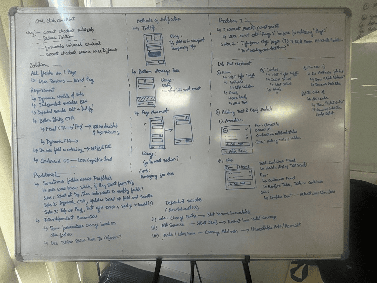
Prioritisation Matrix

Information Architecture


Wireframes and Early Designs


Tested User Stories
As screens were getting developed we tested the flows with internal users and stakeholders.
40+
User Flows Tested
20+
Prototypes
Final Solution
Driving Cashless Orders through New Reorder Flow


Hi-Fidelity Screens and Core Flows
Effortless Checkout Process
Simplified Checkout: Easily fill and verify required details before purchase.
Add Beneficiary On-the-Go: Quickly include a beneficiary during checkout if needed.
Service Specific Checkout Flows
View Original Prescription: Easily access the digitized prescription of each reorder card.
Report Card Issues Instantly: Quickly flag and resolve any problems, ensuring user trust and convenience for the user.
Experiment
New One-Page Checkout
Experience Unification: Reduced steps and cognitive load by consolidating information, enabling faster transactions and laying the foundation for a unified checkout experience.
Focus on Speed: The design prioritizes efficiency, enabling users to complete transactions in seconds, improving overall satisfaction.
FTUE and Storytelling
Guided Onboarding: A prominent FTUE nudge introduces the reorder feature, ensuring users are aware of its value proposition from the start.
Engaging Animation: A scanning animation explains how reimbursement data is digitized into reorder cards, doubling as a loading screen while APIs fetch data.
Delightful Introduction: The animation creates a "wow" moment, highlighting the platform's ability to simplify healthcare reordering and build user confidence.
Component Playground and Design System
Facilitated developer independence by creating a Component Playground for component states and edge-case testing. This enabled seamless UI builds, especially for junior developers, and contributed reusable organisms to our Mozaic Design System.


Feedback & Iterations
Validating the Design with More Users
Conducted usability tests with 15 random Medibuddy employees and 10 external corporate users to gather actionable feedbacks to improve upon.
Usability Testing Feedback
4.7
Ease of Navigation
4.2
User Trust
4.6
Information Clarity
4.5
Overall Satisfaction
Actionable Insights
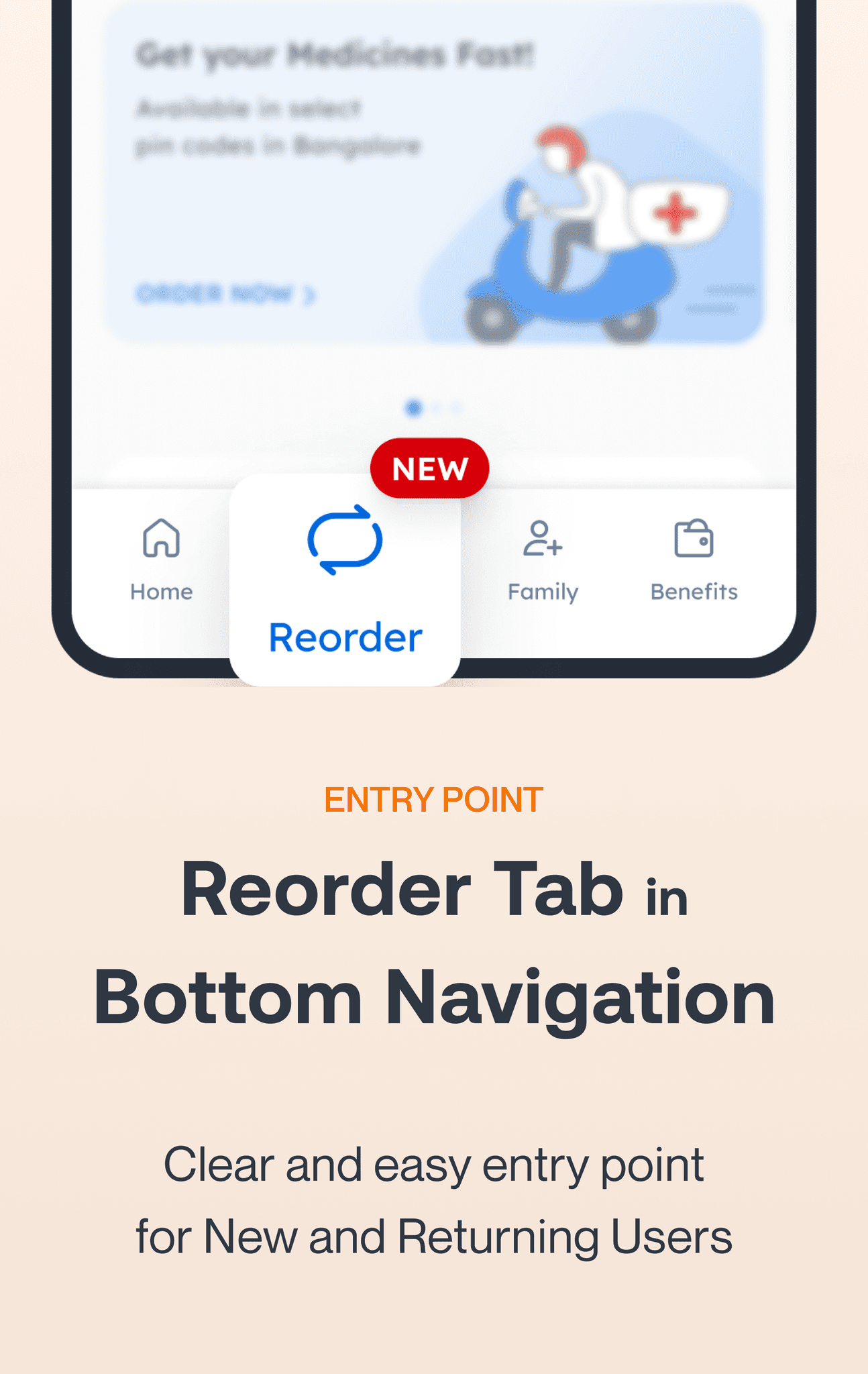
User missed the 'Reorder' tab.
Added FTUE with a tooltip nudging on the reorder tab.
Improving Cart Differentiation
Some users struggled to distinguish between similar carts. To resolve this, added order dates to reorder cards, providing clear differentiation.
Dead-end flow when verifying reimbursement records
Added an "Order Again" CTA on the record verification page.
Successful Unified Checkout Test
Users found the new checkout positive, but a tech-stack upgrade is required for future release.
IMPACT CReated
Positive Results and road to 100 cr
Behaviour Shift Towards Cashless Adoption
Cashless Adoption Rate Increase
15% to 23%
within 3 months of launching the R2C Reorder feature
'Only Reimbursement' Percentage Decrease
40% to 21.7%
of total users did Pure Reimbursement, showing strong Cashless Signals
User Engagement Improved
MAU for Release Month
31% to 35%
DAU for Release Month
14% to 20%
60% to 82%
Revenue Projections Exceeded
Average GMV after 3 months
12 cr
Estimated Revenue from R2C for FY26-27
200 cr!

IMPACT CReated
Key Takeaways
Transparency Builds Trust: Clearly explaining how reimbursement data was digitized helped build trust and encouraged adoption.
Dynamic Personalization Works: Dynamically arranging service carousels based on user behavior improved engagement.
Iterative Testing is Key: Usability testing uncovered critical issues that were addressed before launch.